


If you have recently shifted from react to react-native, you might be wondering that why are we not using any units for styling our components, or maybe you are wondering what are these "dp" units, if you are coming from native android development. So, in this article, we will try to answer these questions.
Styling units for the web
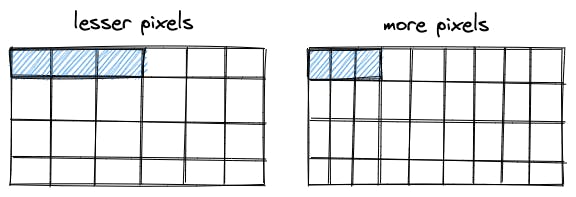
On the web, we have two types of styling units, relative and absolute. We majorly use relative styling units such as px, em, rem, vh, vw, etc..., these units help us to allocate the number of pixels to an element. Pixels can be considered as very small square boxes on the screen. Different screens have different pixel accommodating capacities.
So, if we allocate a component 3pixels, then that component is going to take up 3pixels from the screen. Now that component might look large or small, depending upon the pixel density or the pixel accommodating capacity of the device.
The lesser the pixel density, the larger our component will look.
Styling units for React-Native
The question comes back to that why are we not using any units for styling our react-native components? That is because react-native by default uses Density Independent Pixel(dp) and so we don't have to explicitly mention "dp" as the unit. React-Native only supports density independent pixel and it does not support any other units such as px, em, rem, vh, etc.., although it does accepts percentage values but then those percentage values need to be in the form of strings.
Why cannot we use "px" as the styling unit in React-Native?
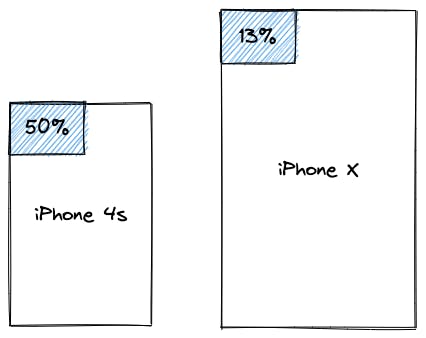
Let's just suppose for a moment that React-Native supported "px" units just like on the web. Now let us assume that we have a component, and we want that component to take half of the available width of our mobile device(iPhone 4s), so we set the width of the component as 320px, since the resolution of iphone 4s is 640 X 960 pixels. The component works fine as we expected it to be. The problem arises when we try to use the same app on a different device with a different resolution, the same component won't be taking half of the available width as it used to earlier. The same component will be taking 13% of the available width when rendered on iPhone X, since the resolution of iPhone X is 2436 X 1125 pixels. This is happening because of the higher resolution of iPhone X, which means it can pack more pixels onto the screen as compared to iPhone 4s.
So, we need an adaptive unit, since we don't have only one kind of device with only one kind of resolution. This is where dp(Density Independent Pixel) comes in, it is an abstract value, which helps us to render components accurately on different devices with different resolutions.
How does Density Independent Pixel work?
At first, the dp value gets converted into pixels, before the components could get rendered onto the screens. The conversion takes place in accordance with the different screen sizes of different devices.
pixel = Density Independent Pixel * scaling factor
Every device has its own scaling factor. The scaling factor of a device could be found out with the help of the pixel density of a screen, ie., through the dpi( dots per inch ) value of a screen.
scaling factor = dpi value of a screen / baseline density value
where, baseline density value = 160 dpi
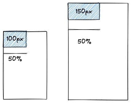
So if a device has a 320dpi screen, then that device would be having a scaling factor of 2. This means, 1dp = 2 pixels, i.e., one dp occupies two pixels.
So if we have a component with a width of 50dp, then that component would take up a width of 100 pixels in a device with a scaling factor of 2, and in a device with a scaling factor of 3, it would take up a width of 150 pixels.
So this is how the Density Independent Pixel adapts itself, according to the screen size of a device. Therefore, no matter the size of a screen, the styling will always be consistent across all the devices, irrespective of the pixel density.
The pixel density can also help us find the resolution of a screen. Suppose if the pixel density of a device is 320dpi( each inch can accommodate 320 pixels ) and the size of the screen is 4 X 5 inches. Then the resolution of the screen would be:-
(320 x 4) X (320 x 5)
1280 X 1600 pixels.
Styling units for native android development
In addition to dp, android also supports sp.
What is sp?
Well, sp stands for Scale Independent Pixel, it is similar to dp, but android resizes it based upon the font size of the device and hence it should only be used in the case of the text.
I hope this helped you to get a better understanding of the Density Independent Pixel.
In case this article helped, then make sure to give it a like.
Reach me out: linktr.ee/iambiswanath